I’ve updated my color wheel charts with the new 2022-2024 in colors and I wanted to make a special blog post to show them to you along with the color schemes for each of the new designer series paper sets.
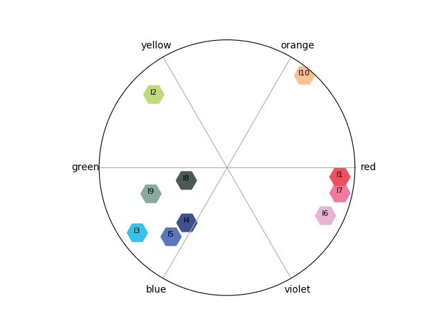
Let’s start with the in colors. They are very vibrant and fun!

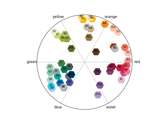
Next let’s take a look at the full color offering from Stampin’ Up!. If you want to know more about how to read these figures or how they were created you can read my original post here.
Recently I’ve been hearing about this concept of “color buddies” from Stampin’ Up!. Apparently, when developing new colors they consider which of the existing colors it goes well with and could be used together in multi-step stamping of images. A good example is the new sweet sorbet being a color buddy to calypso coral and petal pink. Starry sky and orchid oasis are color buddies of eachother. Parakeet party seems to be a color buddy of granny apple green and soft seafoam. Finally, tahitian tide may be a color buddy of balmy blue and pacific point.
Anyway, let’s move on to talking about the new designer series papers. Below I’ve paired each paper set with it’s color wheel and offered a few thoughts on each.
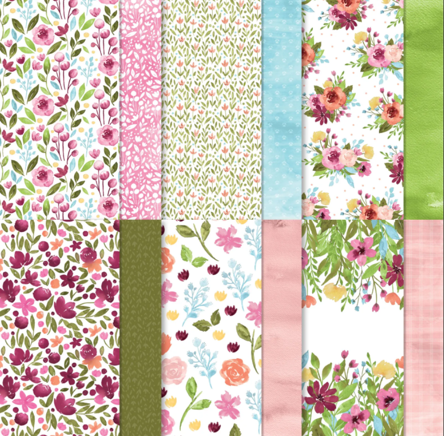

First up is Awash in Beauty. It’s got a lovely range of hues and values with mostly subtle colors but anchored by mossy meadow and merry merlot, plus a punch of brightness with granny apple green, polished pink, and calypso coral.


Next is Abigail Rose. It’s a very subtle and neutral warm color pallette. It has kind of an antique feel.
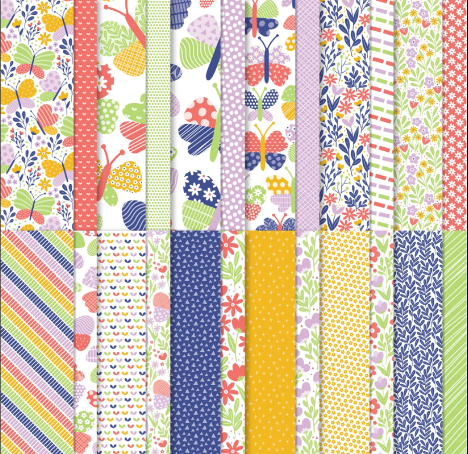

Butterfly Kisses has almost the exact opposite color pallette with vibrant colors distributed around the pallete. It’s got almost all the new incolors, just missing tahitian tide, but good representation around the wheel in terms of hue. Like awash in beauty its got a good mix of subtle and bright colors.

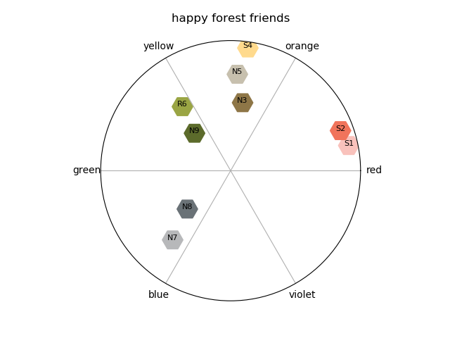
Happy forest friends has a very earthy pallete with lots of neutrals and just a few colors. It feels very modern and reminds me of trends for baby room decor with the forest animals, and gray mixed with yellow, green, and orangey red.
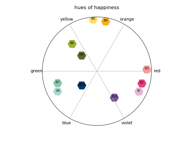
Hues of happiness is another paper collection with good distribution in hue. It’s got full rainbow coverage and a nice bright pallette with a few subtle colors to tone it down a little, similar to butterfly kisses, but with more of the regular color family colors.


He’s the man, I really like the patterns, but I’m not loving the color pallette. It’s not neutral enough to lend itself to any color you like and the colors it does include don’t really go with one another. So, it just doesn’t feel very versatile.


For lovely linens I like the color pallette. There’s a lot of richness and sophistication. The patterns on the paper don’t wow me, but I bet they are actually great to work with. They won’t steal the show from your focal point, great for layering! Many of the designs are monochromatic or two tone, which means you could easily incorporate other colors on your projects.

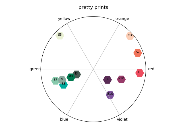
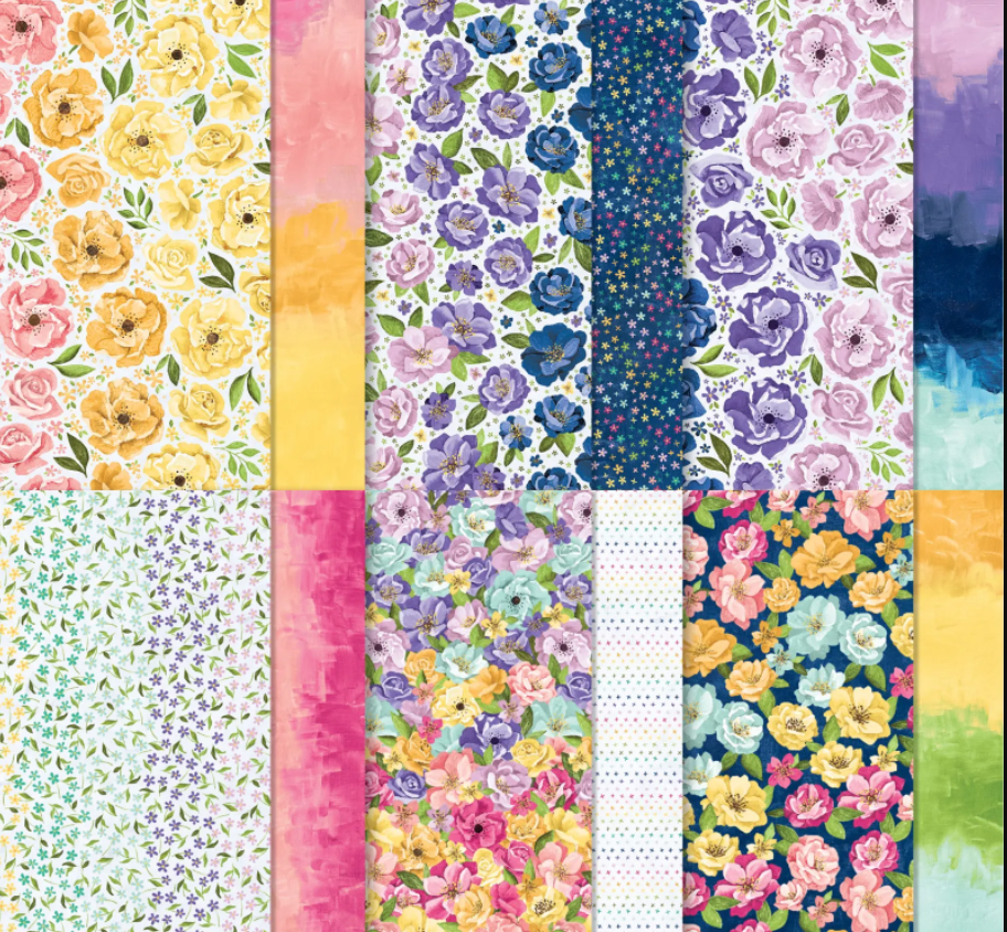
Pretty prints is basically the sun print side of sun prints but in 4 more colors. Each sheet is essentially monochromatic and made up of sets of color buddies: soft succulent, evening evergreen, and garden green; coastal cabana, soft succulent, and bermuda bay; gorgeous grape, rich razzelberry, and blackberry bliss; and sweet sorbet, calypso coral, and petal pink. If you want to be bold you could pair these with complementary colors (a color across the centerpoint of the wheel), or keep it monochromatic by using one of the color buddies.
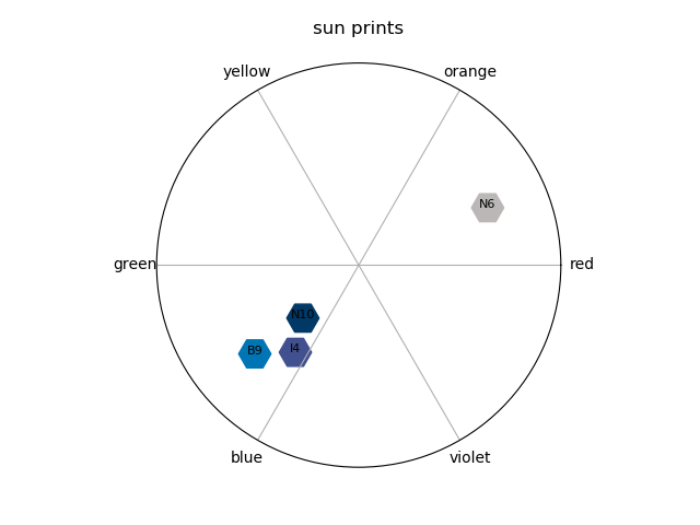
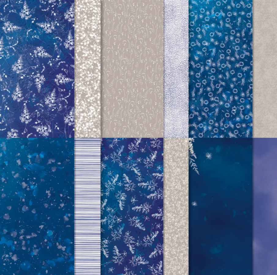
First let me say that sun prints is my favorite DSP of the catalog. These patterns look the most stunning in the blues. And gray granite really warms it up and is always a great neutral for any card. Same advice applies as above. The color buddies here are pacific point, starry sky and night of navy. I’m surprised orchid oasis didn’t make it into this pallette. I would recommend experimenting with that.
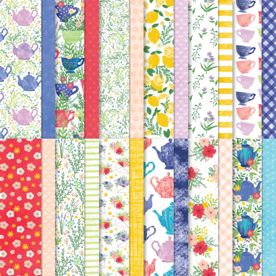

Last but not least is Tea Boutique. Once again we’ve got good distribution in hue around the wheel and a nice balance of subtle and rich colors. All of the new incolors are present, which means it’s also similar to butterfly kisses. But it has a few extra players. It seems like theres an unidentified and unlisted green in here–maybe garden green. If you’re not into the bold patterns of butterfly kisses but like the incolors, maybe this is the paper for you.
I hope you enjoyed my tour through the updated color collection for this annual catalog year. Let me know if you find these color wheels useful and if there are any other questions you have about Stampin’ Up! color. I can probably whip up a chart =)
